

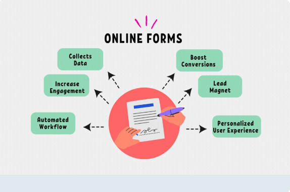
Analyzing Sign-Up Form Data to Improve Conversions
You’ve built a beautiful sign-up form. You’ve promoted it on your site and socials. People are landing on the page. But are they converting?
If your answer is “not as many as I hoped,” you’re not alone.
Many creators, marketers, and businesses overlook one of the most powerful tools in their toolbox: sign-up form analytics.
In this post, we’ll walk you through:
-
Why analyzing form data matters
-
Key metrics to track
-
How to diagnose conversion problems
-
Easy ways to optimize your form based on real data
Let’s dig in.
Why Your Sign-Up Form Data Matters
It’s easy to blame low email sign-ups on a lack of traffic. But in many cases, the real issue is conversion friction; something about your form is turning people away.
That’s where analytics come in. When you track how people interact with your forms, you can:
-
Spot where users are dropping off
-
Find out which form elements are working
-
Test improvements that lead to more sign-ups
-
Optimize every step of your email list growth
Key Metrics to Track
1. Views (Impressions)
The total number of people who saw your form.
Helps you understand traffic volume and exposure. If views are low, focus on driving more traffic.
2. Conversions
The number of people who filled out and submitted your form.
This is your raw “success” number. But it needs context…
3. Conversion Rate
Formula: (Conversions ÷ Views) × 100
A good benchmark?
-
1–3% for cold traffic
-
5–10% for warm audiences
-
10%+ for high-intent or well-optimized forms
Low conversion rates signal friction. High rates = your form is doing its job.
4. Field Abandonment Rate
If your form has multiple fields, some tools track where users stop filling it out.
Example:
Lots of users start but abandon at the “Phone Number” field? That’s a red flag.
5. Device & Browser Behavior
How does your form perform on mobile vs desktop? On Chrome vs Safari?
Some forms break or display poorly on certain devices. Knowing this can uncover UX issues.
6. Time on Form / Time to Complete
Long completion time can indicate confusion or friction.
A simple form should take less than 10 seconds to complete.
Tools to Analyze Your Form Performance
Depending on what platform you’re using, here are some tools that can help:
-
Native Analytics in Form Builders
-
ConvertKit, Mailchimp, ActiveCampaign, etc., offer basic insights
-
Tools like Thrive Leads and OptinMonster go deeper (A/B testing, heatmaps)
-
-
Google Analytics (GA4)
-
Use event tracking to measure form views and submissions
-
-
Hotjar or Microsoft Clarity
-
Record user sessions, view heatmaps, and see how far people scroll
-
Identify where users hesitate or abandon
-
-
A/B Testing Tools
-
Try Google Optimize, ConvertBox, or built-in tests within your email platform
-
How to Improve Your Form Based on Data
1. If Your Views Are High but Conversions Are Low:
✅ Simplify your form (reduce required fields)
✅ Rewrite your headline, make the benefit crystal clear
✅ Improve your CTA button text (e.g., “Get the Guide” > “Submit”)
✅ Use a strong visual or product preview
✅ Test a different lead magnet
2. If People Drop Off Mid-Form:
✅ Remove optional or sensitive fields (e.g., phone number)
✅ Use one-click signup tools (e.g., social/email pre-fill)
✅ Add microcopy to clarify what each field means
3. If Mobile Conversions Are Low:
✅ Test your form on different devices and browsers
✅ Use larger font sizes and buttons
✅ Reduce the number of fields or move to a step-by-step format
✅ Remove unnecessary images or pop-ups that block the form
4. If Time-to-Complete Is High: Analyzing Sign-Up Form Data to Improve Conversions
✅ Break longer forms into two steps
✅ Autofill where possible
✅ Use dropdowns, toggles, and checkboxes instead of open fields
Bonus: What to A/B Test
Once you have a baseline of your form data, try running A/B tests on:
-
Headline copy
-
CTA button color and text
-
Placement (inline vs popup vs sticky bar)
-
Form length
-
Lead magnet offer
-
Visual design or background image
Test ONE change at a time, and let it run long enough to reach statistical significance.
Final Thoughts: Analyzing Sign-Up Form Data to Improve Conversions
Your email sign-up form is more than a tool, it’s a handshake. An invitation. The first impression of your brand’s value.
The best-performing forms feel effortless to the user. And the only way to get there? Track. Test. Tweak. Repeat.

