

Design Tips for Mobile-Friendly Emails
More than 50% of all emails are opened on mobile devices. That means if your emails aren’t optimized for mobile, you’re losing a massive chunk of your audience and potential conversions.
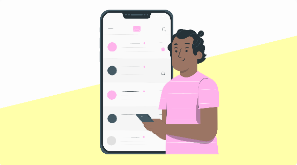
Designing for mobile isn’t just about making things smaller. It’s about creating a seamless, scroll-worthy experience that guides the reader’s eye and gets results even on a 6-inch screen.
In this post, we’ll break down the top design tips for mobile-friendly emails that not only look great but also perform better.
🧠 Why Mobile Email Design Matters
-
1 in 5 emails is deleted within 3 seconds if it’s not mobile-friendly.
-
70% of users will immediately delete emails that don’t render well on their phones.
-
Mobile-friendly emails have higher click-through and engagement rates.
If your email is hard to read, slow to load, or just plain ugly on mobile — you’re losing subscribers and sales.
✅ 10 Mobile Email Design Tips That Actually Work
1. Use a Single-Column Layout
Multi-column layouts can look cluttered or broken on small screens. Stick to a single-column design for better readability and easier scrolling.
🎯 Goal: Simple, stacked content that flows vertically.
2. Keep Subject Lines Short
Most mobile devices cut off subject lines after 30–40 characters, so put the most important words first.
✅ Example:
“Your free checklist is inside 📝”
vs.
❌ “Download your checklist and 5 bonus resources”
3. Optimize Font Size and Line Spacing
Tiny text is a big turnoff on mobile.
-
Minimum font sizes:
-
14–16px for body text
-
22px+ for headlines
-
-
Use 1.4–1.6 line height for easy reading
🧐 Don’t make your reader squint.
4. Use Touch-Friendly Buttons
Tiny links = tiny rage moments. Design buttons that are:
-
At least 44×44 pixels
-
Surrounded by whitespace
-
Easy to tap without zooming
✅ Example:
[Download Now] instead of just a hyperlinked sentence.
5. Keep Images Light & Responsive
Large images can slow down load times — especially on mobile data.
-
Compress images before uploading
-
Use responsive image sizes (so they scale properly)
-
Add alt text in case they don’t load
🎨 Tip: Use images to enhance, not distract.
6. Stick to a Clear Visual Hierarchy
Think: Headline → Supporting Text → CTA
Make it easy to scan:
-
Use bold for key phrases
-
Break content into short sections
-
Use bullet points for clarity
📚 People skim on mobile — guide them through it.
7. Avoid Side-by-Side Elements
Columns, images next to text, or two buttons next to each other often break or stack poorly on mobile.
📱 Mobile layouts are vertical — design with that in mind from the start.
8. Test Dark Mode Compatibility
A growing number of users read emails in dark mode, especially on iOS and Gmail.
-
Use transparent PNGs
-
Avoid pure black text on pure white backgrounds
-
Test your email in both light and dark modes
🌙 Your sleek email shouldn’t become a spooky ghost in dark mode.
9. Shorten Your Content
You don’t need to cram your entire blog post into an email. On mobile, less is more.
-
Write tight copy
-
Use white space generously
-
Link out to longer content
🧽 Treat every sentence like prime real estate.
10. Always, Always Test on Mobile
Before hitting send, preview your email on:
-
iPhone & Android (or use your ESP’s built-in tester)
-
Different email clients (Gmail, Outlook, Apple Mail)
-
Both light and dark modes
✅ Use tools like:
-
Litmus
-
Email on Acid
-
Your ESP’s mobile preview feature
🛠 Bonus: Mobile-First Tools & Templates
Most modern email platforms offer mobile-friendly templates out of the box. Still, here are some tools to streamline the process:
-
Stripo – drag-and-drop responsive email builder
-
BeeFree – mobile-optimized design editor
-
Mailchimp, ConvertKit, ActiveCampaign – all have responsive default templates
-
Canva – for designing email graphics that look good small
🧪 TL;DR Mobile Email Design Checklist
Before you send that email, check:
✅ Single-column layout
✅ Short subject line & preheader
✅ 16px+ body font and clear spacing
✅ Big, thumb-friendly buttons
✅ Compressed and responsive images
✅ Easy-to-scan content blocks
✅ Tested on actual mobile devices
🚀 Final Thought: Mobile Isn’t Optional — It’s the Default
Designing for mobile first isn’t a luxury anymore — it’s table stakes. If your email doesn’t look good in someone’s hand, they’ll swipe away in seconds.

